Aurora, Behind the Shoot
Earlier this year, I worked on a new campaign for Aurora, a designer eyewear collection launching within Specsavers that focuses on timeless, confident style for women over 60. The project brief was to create a clean, elegant hero image that would front the new brand identity across posters, display panels, and in-store point-of-sale.
The creative direction called for a look that felt refined but natural, something that showed confidence and warmth without tipping into high-fashion gloss. The challenge was to capture that balance in a single, versatile image that could work across multiple formats.
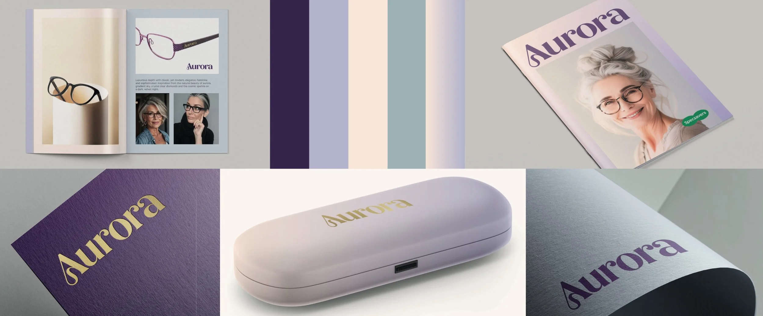
Aurora Branding
The concept
The creative direction for Aurora was feminine, sophisticated, and quietly confident — a look that celebrates style at every age. The brief called for casting fashion-forward older models with individuality and character, bringing a sense of real-world elegance to the brand.
Styling was built around layered textures, jewellery, and subtle tailoring, details that feel considered and personal, echoing the same craftsmanship found in the eyewear itself. Every element had a purpose, creating a look that felt complete without being overstated.
The photography needed to reflect that same balance. We shot against neutral backgrounds selected from their colour palate to keep the focus on the person, the personality, and the frames themselves, the finishing touch that completes the look. The overall tone was elevated yet effortless, a quiet statement of self-assurance and modern elegance.
The design direction followed suit: stylish but simple, allowing the photography to carry the emotion and tell the story.

Art direction mockups
Casting and direction
Casting was all about finding genuine character, someone who embodied confidence, individuality, and understated style. The Aurora campaign aimed to represent women with a natural sense of elegance, the kind that comes from experience rather than trend.
We reviewed several potential models, each bringing something different, but Bella immediately stood out to the art directors. She had a warmth and authenticity that felt completely in line with the Aurora woman, self-assured, expressive, and stylish without effort. Her look carried both approachability and sophistication, which made her the perfect fit for the brand’s tone and audience.

casting test image
Planning, prep and lighting
Pre-production started with a lighting diagram proposal and then began testing background colours to ensure everything sat comfortably within the Aurora brand palette. We built and painted new backdrops, measured everything to scale, and spent a prep day in the studio fine-tuning light placement and composition before the shoot.
We worked out of Étienne Laine’s studio, with his help on setup and logistics. The shoot was a small, contained production, but we built a compact video village in a separate room so the creative team and clients could view the session live without crowding the set.
The final lighting design used a large diffused key light, 2 panels of controlled negative fill either side to help shape the models face, and two backdrop lights for control over separation. I kept the contrast low and the fall-off smooth so the tones would reproduce well across the models face.
We pre-lit the day before the shoot to check colour consistency and any glasses reflections, then locked exposure and tone during the model test. Once the lighting and overall setup were signed off, we were ready for the main shoot day.

Initial Lighting diagram
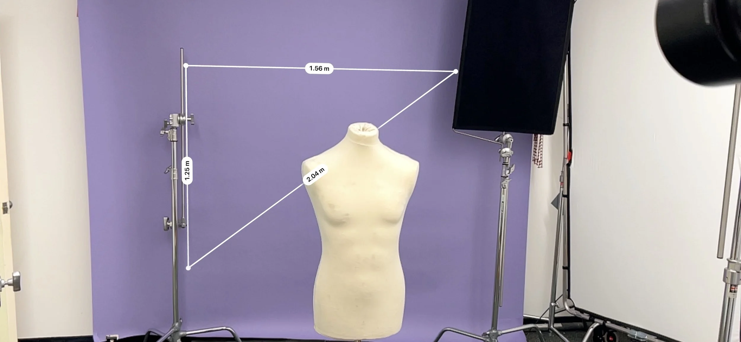
Measuring background dimensions for painted flats.

Painting up flats with brand colours

Painting Flats in stuido

Testing Lighting setup

Back of the camera lighting preview

Testing for glasses reflections
The shoot

on screen graphical layout previews
With everything pre-lit and signed off, the shoot day ran smoothly. We shot entirely on the Hasselblad X2D, tethered for live review so the art directors could see every frame as it came through with on screen graphical layouts to help them visualise the final look of the images in situ. The goal was to keep the set calm and focused, giving space for genuine moments rather than overly directed poses.
We used a few different techniques to draw out natural expression, moments of conversation, subtle prompts, and small adjustments between takes to keep the energy authentic. Shanine handled makeup and hair touch-ups throughout the day, keeping a close eye on every detail as the images came through. She was constantly checking for stray hairs, reflections on the lenses, and small wardrobe fixes that can make or break a clean final image.
We explored several looks and outfit combinations, making small refinements each time. Both art directors worked closely with me at the monitor, giving instant feedback as we tried new poses and expressions. By the end of the day, we’d captured around 1,500 images, narrowing them to 150 selects, then to a final 15 hero shots for marketing rollout, with one key image chosen to lead the campaign.

raw images from the day

raw images from the day

raw images from the day

raw images from the day

test layouts

test layouts
Post-production and rollout
Retouching was intentionally light — a natural finish with subtle tonal warmth and a soft background gradient that tied into the Aurora palette. The approved portrait was then rolled out across a set of layouts for in-store use, including posters, header strips, and product displays.

final image

Final poster design
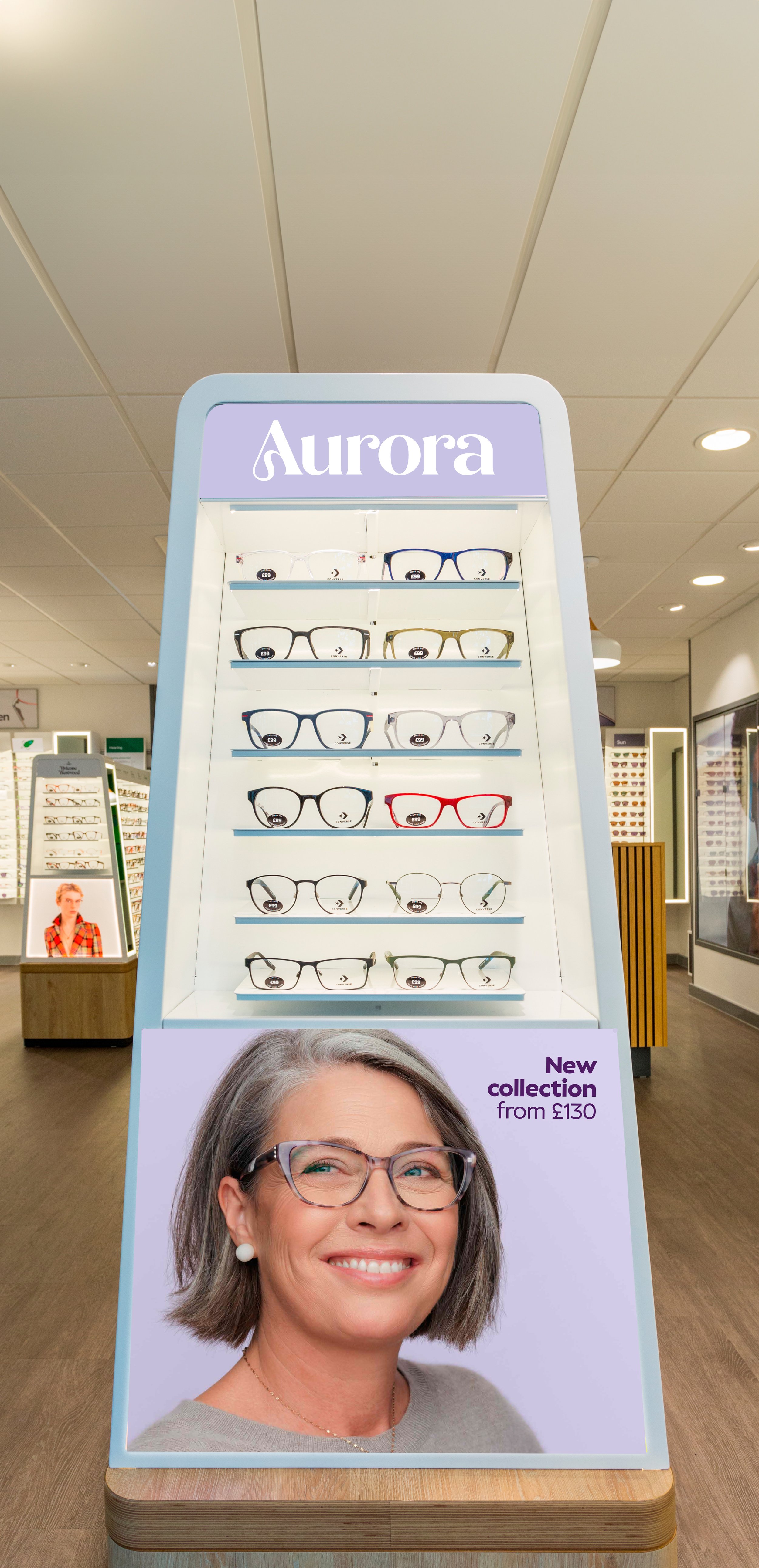
In store point of sale
Seeing the final piece in store was one of those moments where everything clicks, all the planning, lighting tests, and back-and-forths distilled into a clean, confident image that fits perfectly with the brand.
Credits
Photography & Direction: Elliott Mariess
Assistant: Lenny Lenfesty
Client: Specsavers Creative
Talent: Bella
Hair & Makeup: Shanine Le Levrier
Art director: Helina
Producer: Diya
Client partner: Hannah
Design Team: Helina & Aimee
Post-production & Layout: In-house creative team
Final thoughts
What I love about this project is how much we achieved with a small team and a clear vision. It’s proof that even under pressure, when the creative direction is strong and the team’s aligned, you can produce something polished, warm, and genuinely human.